Pour la plupart des gens, la typographie est une réflexion secondaire. Jusqu’à ce qu’une mauvaise police rende une page réellement difficile à lire. C’est à ce moment-là que l’on commence à se rendre compte que cet élément auquel on ne prête généralement pas attention fait une grande partie du travail.
Elle n’influe pas seulement sur la lisibilité et l’accessibilité. Le choix de la police peut aussi influencer ce que ressent un lecteur face à ce qu’il lit, que cela paraisse autoritaire, ludique ou accessible. C’est également un élément essentiel de l’image de marque.
Lorsqu’une marque possède sa propre police sur mesure qui apparaît à chaque point de contact, du site web et des e-mails aux contenus sur les réseaux sociaux, cela contribue à renforcer la reconnaissance et la confiance au fil du temps.
C’est pourquoi Spaceship a créé sa propre police personnalisée : Spaceship Sans.
L’inspiration derrière Spaceship Sans
L’une des principales raisons de créer Spaceship Sans était d’étendre l’identité visuelle unique de Spaceship. Jusqu’à présent, Proxima Nova était la police privilégiée de la marque. Bien qu’elle soit polyvalente et efficace, elle n’est pas propre à Spaceship.
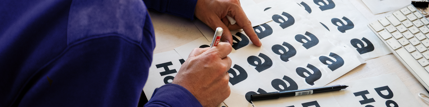
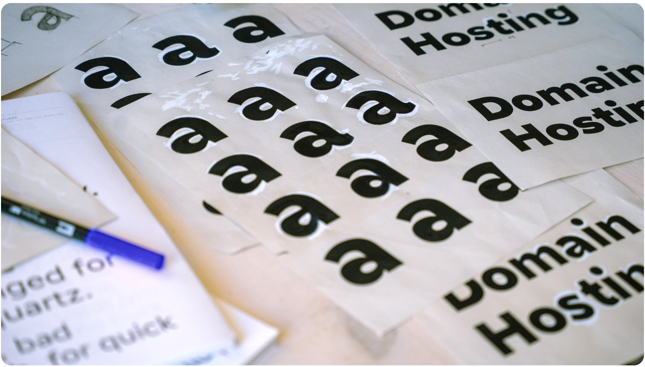
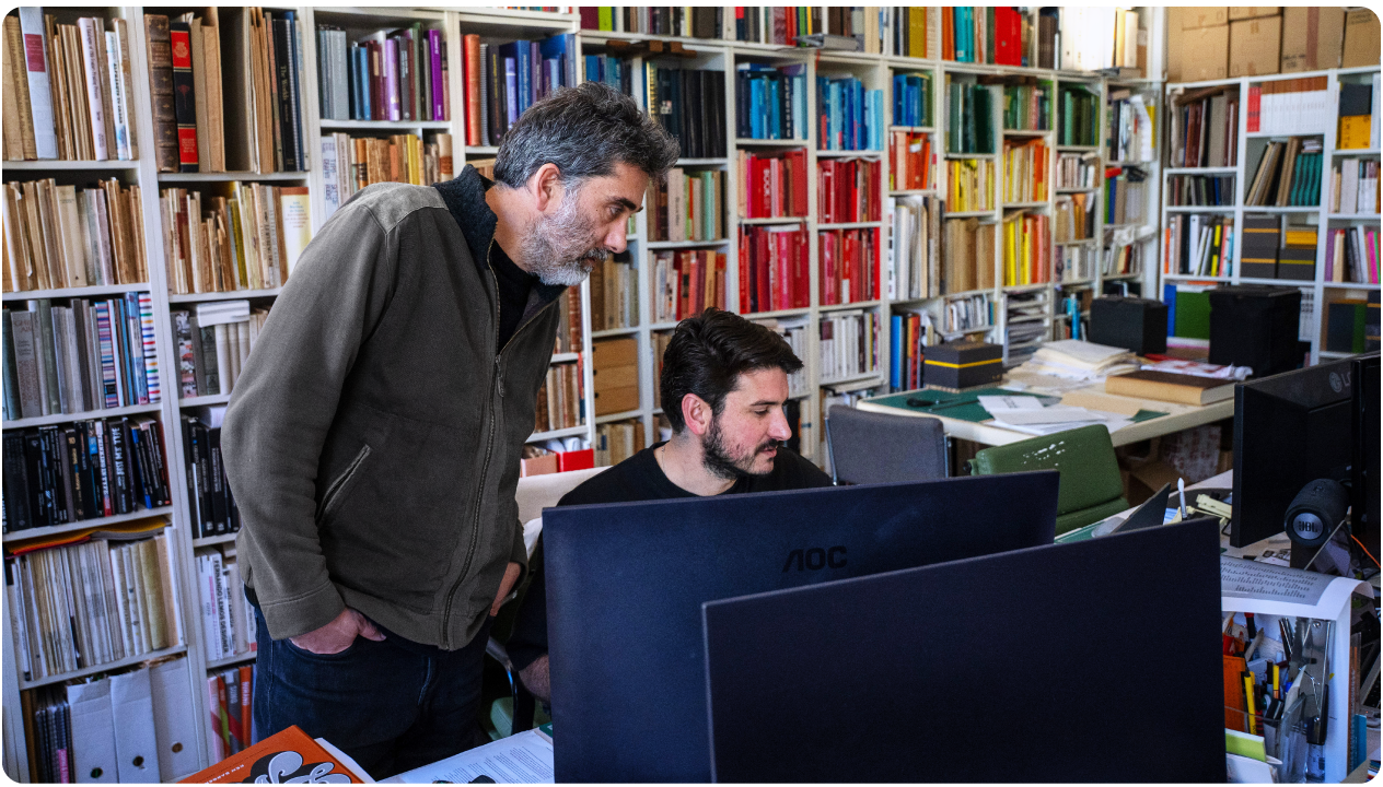
Ainsi, une police sur mesure était l’étape logique suivante. Et 0.Itemzero a été sollicité pour aider à la concrétiser, avec la contribution des propres designers de Spaceship, qui ont fourni orientation et retours à chaque étape.
0.Itemzero est un studio de design portugais primé, spécialisé à l’intersection de la technologie, du design de l’information et du design éditorial. Il a travaillé avec des marques de renom, telles que HBO, Disney et FIFA, dans une multitude de secteurs, du jeu vidéo au cinéma.
À propos de l’inspiration derrière la police, 0.Itemzero déclare :
« Nous voulions que la police suive les mêmes principes que le système de design de Spaceship : très structuré, géométrique, mais humanisé. »
Les principes directeurs
Afin d’assurer le développement cohérent du caractère, du ton et de l’objectif de la police tout au long du processus créatif, un ensemble de six principes directeurs fondamentaux a été établi. Les voici :
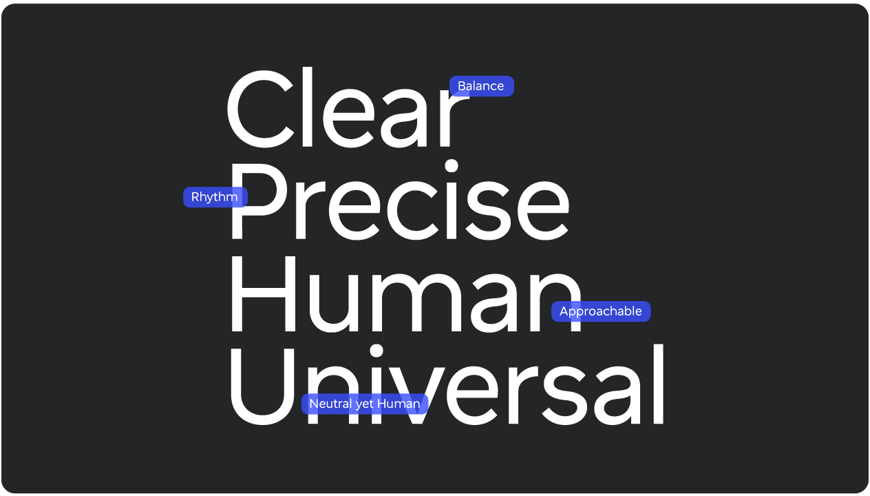
Empower – Amplifier la voix de l’utilisateur en rendant les mots clairs et impossibles à ignorer. Clair, assuré, jamais écrasant.
Elevate – Trouver la sophistication dans la précision et le détail, où chaque détail sert un objectif. La simplicité avec intention.
Guide – Établir des hiérarchies visuelles, pour permettre une lecture fluide et intuitive. Une structure qui guide naturellement.
Adapt – Aussi puissante sur un petit écran que sur un grand panneau d’affichage, en s’adaptant à n’importe quel contexte sans perdre son identité. Flexible par conception.
Inspire – Inviter le regard à explorer la convergence entre calcul et création. De la curiosité dans chaque forme.
Connect - Éviter les clichés et les stéréotypes et être accessible à tous, quelle que soit leur manière d’interagir avec la technologie.
Ces principes ont façonné chaque décision prise par les designers au cours du processus, contribuant à donner à Spaceship Sans une identité résolument Spaceship.
Ce qui distingue Spaceship Sans
Le résultat est une police qui permet d’adopter un ton conversationnel avec le public de Spaceship sur toute la plateforme et au-delà. Son esthétique assurée, directe mais conviviale, s’inspire de trois traditions typographiques :
Grotesque – pour un sentiment de neutralité et de fonctionnalité
Geometric – pour la clarté de la forme
Humanist – pour la chaleur et l’accessibilité
Comme le dit 0.Itemzero :
« Spaceship Sans est un hommage à la typographie du milieu du XXe siècle, une chimère de polices sans empattement grotesques et géométriques, mais sans leur austérité. Spaceship Sans a été conçue pour accompagner la technologie, et la technologie peut être un vecteur d’émotion. »
Comment Spaceship Sans sera intégrée à Spaceship
La police sera utilisée sur le site de Spaceship, dans ses services, sur les réseaux sociaux, et plus encore. Spaceship Sans a été créée pour s’intégrer harmonieusement à la plateforme existante sans perturber ce à quoi les utilisateurs sont déjà habitués. Comme le dit 0.Itemzero :
« Si les utilisateurs continuent à vivre leur vie comme ils l’ont toujours fait, tout en ayant le sentiment que quelque chose est différent, mais en mieux, alors nous avons brillamment fait notre travail ! »
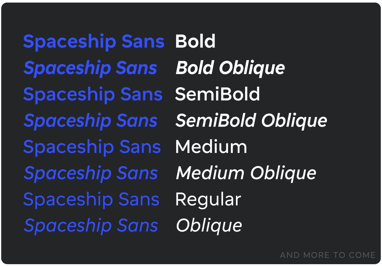
Elle sera également appliquée de manière universelle, quelle que soit la langue, car cette police est accessible à des milliards de locuteurs dans le monde. Elle prend en charge plus de 707 langues dans deux systèmes d’écriture : latin et cyrillique, avec 8 309 glyphes individuels, 7 graisses et 2 styles.
Une nouvelle façon de découvrir Spaceship
Spaceship Sans n’est pas simplement un autre élément de marque. Elle donne à Spaceship une voix qui lui est entièrement propre, une voix qui créera un lien avec les utilisateurs à chaque fois.
Au moment où vous lirez ceci, Spaceship Sans sera utilisée sur toute la plateforme Spaceship. Un changement fluide que vous n’aurez probablement pas remarqué, mais qui améliore malgré tout votre expérience. Merci à 0.Itemzero et aux designers de Spaceship de lui avoir donné vie.

Articles suggérés


Partagez vos pensées